The Physical Weight of the Gaelic Word
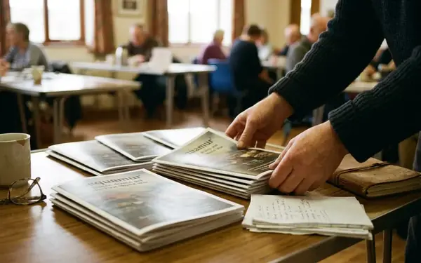
A Gaelic volume from the hand-press period rests on a foam cradle. Warm light strikes it at a low angle, roughly 30 to 45 degrees, and under a 10× loupe the page stops being flat. The letters have bite. Ink has spread into the fibres, edges have worn, and the shallow relief where metal type pressed into paper catches the light like a shoreline at low tide.
Reading a page this way means comparing several instances of the same letter across at least two gatherings. A single d tells you little; a dozen of them, tracked from one signature to the next, reveal type wear, casting quirks, and the compositor's habits. This is where the study of Gaelic typography properly begins—with the physical object, not the abstract idea of a script.
Scottish Gaelic moved into print by the 1560s, and a Gaelic liturgical book appeared in 1567, while the manuscript tradition it grew from reaches back through the late medieval period. An honest comparison of letterforms can therefore span roughly 1400 to 1825, from the scribe's broad-edged pen to the punchcutter's steel.
The Argument in Brief
Typography in Scottish Gaelic carries the language's cultural visibility and its archival integrity. Historical letterforms moved from manuscript hands into metal type under real mechanical constraints. Digital revival remains technically demanding, and institutional signage still tests whether Gaelic reads as ordinary public information. The article closes with a single recommendation: commission new Gaelic typefaces rather than lean on generic system fonts or historical revivals alone.
Typography here does more than decorate the page. It determines whether the language appears as a working system of writing or as a decorative flourish laid over English.
From Manuscript to Matrix: Historical Context
The production chain shows the shift plainly. A scribe shaped letters with a broad-edged pen, controlling weight through the angle of the nib. A punchcutter later cut those shapes in steel, a matrix maker struck them into copper, and a compositor and press operator turned them into repeatable impressions. Each step traded the fluid hand for mechanical consistency.
Insular and later Gaelic manuscript hands carried distinctive forms of a, d, g, r, and t. Lenition, the softening of a consonant, could be marked with a dot placed above the letter. In later Scottish Gaelic printing an added h became the prevailing convention instead, giving the familiar clusters bh, ch, dh, fh, gh, mh, ph, sh, and th.
Typographers faced a choice between two traditions. One route adopted standard Roman type and accepted its neutral, widely available forms. The other attempted bespoke faces that echoed the manuscript hand, honouring the visual memory of the scribes at the cost of expense and legibility.
From the 1560s through the 1800s, Gaelic printing occupied both camps at once. That mixed inheritance carries a warning for anyone dating a page: a single ornamental letter proves nothing. Paper, spelling, punctuation, type wear, and the context of publication have to be weighed together before a page can be placed in time or culture.
Navigating Identity: Cultural Signal vs. Pastiche
A contemporary Gaelic design can be judged in a series of passes. First a fluent reader checks spelling, accents, lenited forms, and whether words are recognisable at a glance. Then the designer works the same face through body text, headings, captions, and all-capital settings to see where it holds and where it fails.
A credible text face needs clear grave-accented vowels—à, è, ì, ò, and ù,in both lowercase and uppercase, alongside punctuation and quotation marks suited to the publication. Those accents have to stay identifiable at caption and wayfinding sizes rather than collapsing into the body of the letter.
The failure mode is easy to picture. A poster sets an uncial-style English headline, wraps it in knotwork, and drops the Gaelic translation underneath in a smaller generic font. The surface looks Celtic. The actual Gaelic receives less space, weaker hierarchy, and no language-specific care. That is Celtic kitsch: ornament standing in for respect.
Reclaiming the Letterforms
Between roughly 1990 and 2025, the desktop-font and web-font era handed designers contextual alternates, localised glyph forms, variable weights, and expanded character sets. These tools let a display line quote the historical hand while paragraphs keep conventional, readable shapes. A designer can gesture toward the manuscript without forcing a reader to decode it—the resonance stays, the legibility survives.
The Archival Challenge of Digital Translation
Digitisation starts with a character inventory built from representative pages: title pages, damaged leaves, italic passages, and sections crowded with diacritics. Staff then make a preservation capture, commonly at 400 to 600 pixels per inch for small or worn type, holding grayscale or colour whenever stains, show-through, rubrication, or paper tone affect recognition. Files for optical character recognition are generated separately from that preservation master.
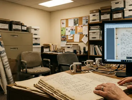
Material printed between roughly 1750 and 1900 carries recurring hazards. Long s can be read as f. Dotted consonants can lose their dots. Broken sorts split one letter into several stray marks, and ink bleeding from the reverse of the leaf gets misread as punctuation.
Mark the Doubt, Don't Erase It
No single OCR configuration reliably handles clean Roman Gaelic, manuscript-derived display type, fractured metal type, and handwritten annotation at once. Damaged or uncommon pages need manual comparison against the image, and uncertain readings should stay explicitly flagged rather than quietly normalised into something tidy.
Unicode supplies the foundations. Precomposed Gaelic vowels with grave accents exist, and combining marks such as COMBINING DOT ABOVE, U+0307, cover cases where historical transcription demands them. Insular-looking a, d, g, r, or t forms are generally glyph designs rather than separate letters, and they belong in the typeface's shaping behaviour, not in the character stream.
Context governs the encoding decision. A dotted consonant suits a diplomatic transcription or a historically grounded display face, while contemporary Scottish Gaelic body text normally takes h-based lenition. The choice turns on date, editorial policy, audience, and whether the project preserves original spelling or offers a modern reading text. Institutions such as the National Library hold the Scottish Gaelic collections that make these decisions concrete rather than theoretical.
Institutional Use and Public Visibility
Institutional typography deserves approval at the level of complete sign and page systems, not isolated translated phrases. A bilingual team first agrees the information hierarchy, then assigns comparable type sizes, weights, and positions to each language. The unit of design is the whole wayfinding scheme, not a single ceremonial heading.
The Gaelic Language (Scotland) Act of 2005 established a statutory framework built on equal respect for Gaelic and English. Since then public bodies have had a concrete policy basis for treating Gaelic as operational public information rather than optional ornament, and implementation across the 2005 to 2025 period can be examined on those terms.
A practical parity audit records language order, type size, x-height, weight, line spacing, contrast, viewing distance, and the number of locations where each language appears. Equal nominal point size can still produce unequal prominence: a face with a smaller x-height or lighter strokes recedes even when the numbers on paper match.
Visibility works cumulatively. Where directional signs, ticketing, labels, publications, and digital navigation repeat Gaelic, the language reads as capable of carrying ordinary institutional functions. A lone ceremonial banner above English-only instructions communicates a narrower status—and speakers notice the difference between the two. Seeing a minoritised language rendered with deliberate typographic care asserts that it belongs in the working life of the institution.
A Typographic Mandate for the Future
Cultural institutions and arts organisations should commission new, bespoke Gaelic typefaces. That is the position this article stands behind.
A commission brief converts ambition into a working document. The commissioning body appoints a Gaelic language adviser alongside the type designer and inventories historical and modern reference material before a single letter is drawn. A realistic planning window for a multi-weight institutional family runs approximately 12 to 24 months, from research and drawing through interpolation, language review, screen testing, corrections, and release, with separate stages reserved for beta use and post-beta repairs.
The deliverables have to be complete: uppercase and lowercase Gaelic, grave-accented vowels, numerals, punctuation, currency and editorial symbols, at least regular and bold weights, web and desktop files, specimen pages, licensing terms, version records, and a character-set manifest. For commissions started between 2026 and 2030, institutions should demand durable font files, documented source material, and migration rights for whatever publishing systems come next.
Historical revivals keep their place in the visual repertoire. They cannot, on their own, serve interfaces, captions, variable layouts, and sustained reading. Relying only on revivals or generic system fonts freezes the visual evolution of the language and quietly signals that Gaelic belongs to the past. Commissioning contemporary Gaelic type is an act of cultural confidence—fund the new families, own the source files, and give the language the letterforms its future publishing will actually run on.